If you ever explored an unfamiliar city on foot using a paper map, you probably are familiar with these two navigation strategies which I use all the time: To get to a specific attraction (like a museum), I try to figure out the overall part of the city it’s in and find the easiest path there. On the other hand, if I don’t have a specific place in mind, I’ll often take a look at what’s nearby, and go exploring a bit; perhaps find an intriguing coffee shop or park nearby.
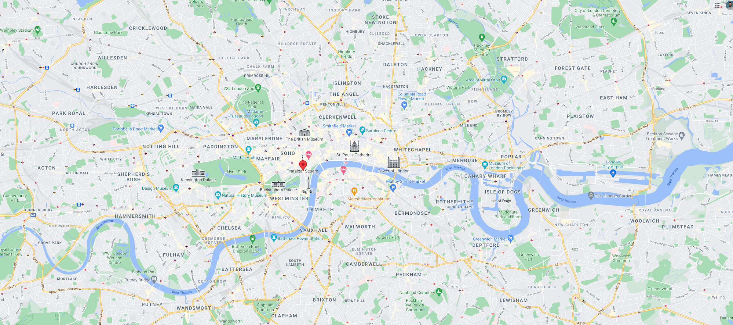
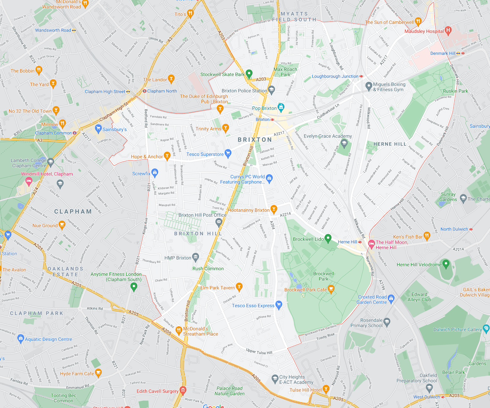
Seeking a specific landmark and exploring a neighborhood require different levels of detail about the city. When I’m trying to get to a completely different part of the city, I’m looking at the overall geography of the city and paths between major areas. If I’m exploring a neighborhood, I’m interested in the options nearby.
These same behaviors of orientation and wayfinding exist for users of websites, and, like in the city-navigation example, the kinds of cues that help users will depend on their information-seeking needs. Most websites prominently feature global navigation (which is analogous to a zoomed-out map of city neighborhoods). Some sites with large numbers of pages also feature local navigation to help users orient and explore content within the current category.
Definition: Local navigation is a type of navigation that is contextual to the user’s current location — showing sibling pages within the current category, and if applicable, the children or nieces and nephews of the current page.
The IA structure of most websites is hierarchical, and a familiar way to visualize that hierarchy is a tree. The global navigation of the site shows the top tier of the tree, no matter where the user currently is in the structure. The global navigation is stable — users can expect that it will remain the same throughout the site and they can use it to jump between major categories. On the other hand, the local navigation shows information about the node the user is currently viewing and also includes the other nodes on the same branch of the tree. Consequently, the local navigation will vary from category to category and will show content offerings that are related (or at least close in the site’s information architecture) to the current page. Local navigation, however, does not vary from user to user or session to session.

Local navigation serves a few purposes simultaneously:
- It indicates the category of the current page and, thus, works as an orientation element, similar to a “You are here” indicator on a map.
- It shows links to other pages (or information) within the same information-architecture (IA) category and, thus, serves as a wayfinding element that tells users where they can go from their current location.
- It facilitates access to deep parts of an IA (e.g., second or third-tier subcategories) that would otherwise require a higher interaction cost to access.

Local Navigation: Appropriate for Exploratory Browsing Behaviors
Local navigation is not appropriate for every site or app, as it takes up a fair amount of real estate. Products that have relatively small information spaces (i.e., few pages overall) are unlikely to gain from visible local navigation. At the other end of the spectrum, sites with deep information architectures often end up with local-navigation UIs that take up too much space on the screen and may benefit from lighter navigation crutches (such as contextual links to related content).
Visible local navigation is usually beneficial when users engage in exploratory browsing, rather than known-item search. In such situations, users may visit several pages within a category — either because they do not know exactly what category they need, even though they have a sense of its neighborhood, or because they need to combine or compare information from multiple categories. For example, a prospective student looking for a degree on a university site may spend some time exploring one program in detail and then jump to another program. Or, someone purchasing a car or an appliance may pogo stick between specifications, gallery, and overview pages frequently.

To figure out if you need a local navigation UI on one or all sections of your site, look for user data (either qualitative or analytics-based) that indicates that your users:
- tend to browse multiple subpages of a category within a single session
- tend to compare or combine information which is displayed on multiple pages (e.g., product information)
- tend to start their site visit on interior pages (rather than on the homepage) and need to stay oriented throughout the session
As you’re designing your local navigation UI, ask if it accomplishes the following goals:
- Is it highly discoverable and recognizable? Will users notice it and are they able to distinguish it from the global navigation?
- Does it support typical pathways between content? Does the local navigation facilitate access to content that is needed in a single session, as users are carrying out a top task?
- Does it incur minimal interaction cost? Is it easy for users to access the local navigation?
In the remaining of the article, we will focus on local navigation for the desktop; in a separate article we address local subnavigation on mobile.
Placement of Local Navigation
On the desktop, local navigation is typically placed in one of two locations: either horizontally, right below the global navigation at the top of the page, or on the left side of the page, creating (together with the global navigation) an inverted-L shape. Like the choice of where to place the global navigation on desktop, choosing where to position your local navigation depends on the particulars of your overall design and the breadth of your IA’s second tier. If your site features a narrow top tier with a many tier-2 categories (as is often found on big-box ecommerce sites that use a lopsided IA structure, with many product categories all rolled up under a single Products item in the top tier), then placing the local navigation horizontally makes little sense.
One benefit of horizontal local navigation is its compactness — generally, it does not intrude on the main content area to the same degree that a vertical design does. That said, both horizontal and vertical local navigation struggle to accommodate deep IA structures. Vertical orientations require deeper and deeper indenting on each subsequent tier, slowly invading the very valuable main content space, while horizontal orientations either don’t show more than one local tier or stack them.
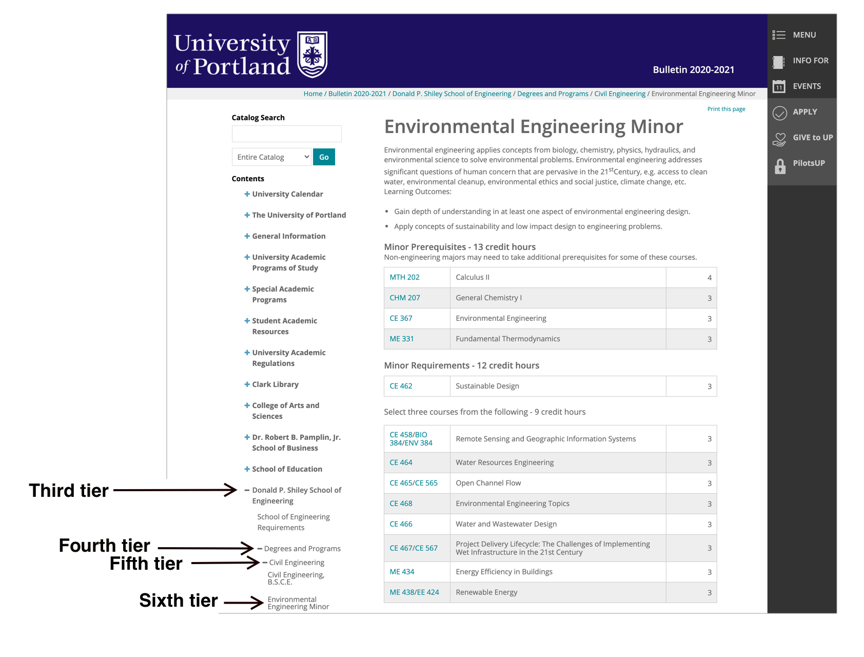
While not often seen, horizontal local navigation can be designed to include a third tier of the navigation without unreasonably encroaching on the content area. But it realistically can support only 2–3 tiers before it intrudes too much upon the main content space. For pages deeper in the content space, consider using breadcrumbs instead of a multilayer or truncated local navigation. While the breadcrumbs offer no visibility of sibling pages, their layout is considerably more compact (usually one line). The depth at which this tradeoff decision must be made will differ for every site, depending on the overall depth of the IA and the specific content areas that tend to be browsed within the same session. The goal is always to consider the specific pages between which users should be able to move and allow users to travel between them as easily as possible.

Local Navigation Should Be Visible, but Less Salient than the Global Navigation
A big benefit of an always visible local navigation is that accessing it does not carry any interaction cost (for example, it doesn’t require hovering or clicking on global navigation), and, thus, related pages are more discoverable. You want the local navigation to be noticeable; otherwise, there is a good chance that users won’t seek it out (in fact, they may not have any expectation that it exists at all).
However, there is some nuance to how noticeable the local navigation should be. In particular, local navigation should not be more salient than the global navigation, because, if that happens, users may mistake the local navigation for the global one. Visual hierarchy should reflect information hierarchy.
For example, Generac’s previous site design featured a highly salient local navigation — high-contrast text and a white background that stood out when superimposed against a large hero image at the top of the page. On the other hand, the global navigation was much less noticeable — low-contrast gray text on a white background. In our testing, users missed the global navigation entirely, thinking that the site’s options were limited to the categories visible in the local navigation.


Summary
Local navigation is a contextually changing navigation UI that is used to show users their current location in the IA of the site, along with sibling and child pages. Ensure that it is designed to take advantage of typical browsing paths, is visible but does not draw more attention than the main navigation, and requires minimal interaction cost.


