I recently started using a new piece of software for tracking expenses. I was excited to try it and, at first glance, it looked like it could be a great solution. Unfortunately, it quickly became apparent that, although the visual design was fine, the experience of interacting with the system was painfully difficult.
It’s not because of bugs or immediately obvious usability issues, such as poorly labeled navigation menus or misuse of icons. This piece of software is a great (terrible) example of how it’s possible to ‘check all the boxes’ and build all specified features, but still end up with a bad result that is frustrating to use.
When Is Just as Important as What
For interactive software for complex tasks, including all the necessary information and features is not good enough; it’s also essential to pay attention to the sequence of steps and organization of the available features. Poorly organized systems force users to repeatedly stop what they are doing, and hunt around for the functions or data needed to complete a task. The resulting experience feels like a constant string of interruptions, rather than progress towards a goal.
Designers must present information and features at the point of need to avoid creating this type of frustrating interface. They must investigate realistic usage scenarios (using methods like contextual inquiry) to understand both the users’ goals and the order in which various subtasks are performed. This detailed understanding of the exact sequence of actions is essential in order to present data and controls in the right place at the right time. Items that all users will need frequently should be highly visible, not tucked away. Steps that follow each other in a linear sequence should be presented together and users shouldn’t have to ‘go fish’ in a navigation menu for the next action.
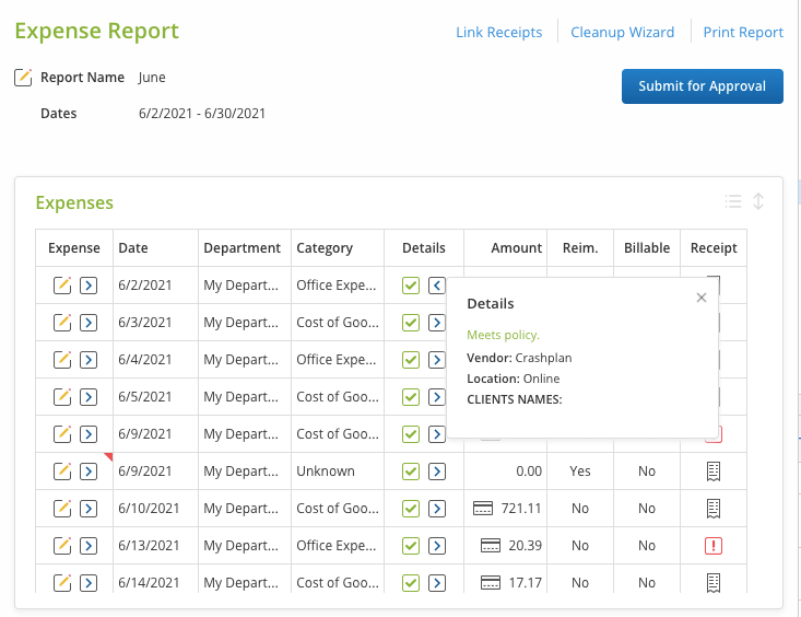
In the expense-reporting software I mentioned, this interrupted flow occurs all the time, in ways both large and small. For example, before submitting an expense report, you need to review each expense to make sure it’s entered and categorized correctly. But the screen where you review the report doesn’t display the vendor names by default. The only identifying, immediately visible information about each expense is the amount. Of course, most users will not recognize a transaction based on the exact amount! If someone wants to see what the expense was for, they must click an arrow to reveal a popup window with the Details for that particular expense. As you might guess, this process gets old really quickly when you have to check multiple expenses. This design imposes a high interaction cost on users just to see basic information essential to the primary task of reviewing the report.

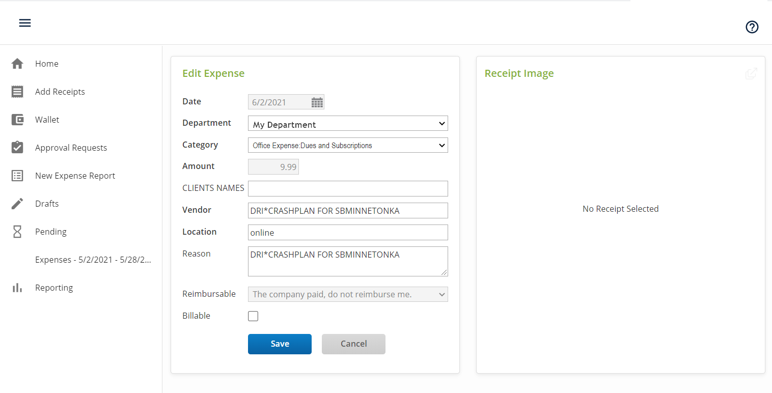
Showing items at the point of need is essential for features as well as for information. In the expense software, expenses with no receipts display a red warning indicator in the Receipt column. After seeing this warning, the next logical step for a user is to upload a receipt for that expense. Unfortunately, the warning indicator is not clickable. And when you click the Edit icon for the expense, the Edit screen shows you very clearly that there’s no receipt attached, but it doesn’t give you a way to upload a receipt!

It is definitely possible to upload a receipt. However, to do so, users must leave this Edit Expense screen, select Add receipts in the navigation menu, then go on a convoluted journey to browse through all receipts and expenses and match them up. This type of detour takes users completely out of the flow of their task (reviewing and submitting an expense report) and requires them to essentially start over on a different one (assigning receipts to expenses).
This software is clearly designed to support a specific task flow: (1) upload receipts, (2) enter information to convert each receipt into an expense item, and (3) collate expense items to form an expense report that’s sent for reimbursement. However, in cases where users take a different task flow (first create the expense items and then add the receipts), the system offers no support. (Even though it would have been so easy to include an Add Receipt button in the empty Receipt pane in the above screenshot.) This is not to say that one task flow is better than the other, but that, depending on conditions, users might prefer one or the other. Usability heuristic #7, flexibility and efficiency of use, calls for such in-place accelerators — unless they add undue complexity, which is a design challenge and why you can’t support all possible task flows but only the more important or common ones.
Use Task Analysis to Identify the Point of Need
The subtle problems that plague this piece of software are all the more frustrating because you can feel how bad the software is, but it’s difficult to articulate exactly what is wrong with it, at least at first glance. It’s annoying for users — because the problems are so hidden that they’re often not discovered until after users and companies have invested time and money into the system. Plus, this type of confusing workflow is not something that people get better at, especially for intermittent tasks like expense reporting. It will continue to be confusing to guess the next step each time.
It’s also frustrating for teams trying to support or improve software with these types of subtle task-flow problems, because users aren’t likely to spontaneously report enough specific details to help them understand the root cause. Careful behavioral study by experienced practitioners is necessary. And, once inefficient workflows are baked into a system, fixing them may involve refactoring or rebuilding existing functionality, rather than moving forward with desired new features. For these reasons, structural problems can linger and persist like a chronic disease — not bad enough to immediately lose all your users, but frustrating enough to make them hate every interaction with your system and long for the day when they can abandon it.
Because it’s so difficult to correct such problems, it’s much better to avoid creating them in the first place, by making sure you have a detailed understanding of exactly what users need at each step of a task, before you begin structuring your software screens. There are several frameworks for accomplishing this:
- Task analysis, to gather detailed steps and map out sequences of actions, is a time-tested method of creating a well-structured application.
- Jobs-to-be-done analysis is a related technique which has become popular more recently and emphasizes goals and outcomes.
Whichever analysis method you use, the core process involves gathering information to understand what, when, and why users need specific information and features. The screens of your application must then be mapped back to what you learned in that analysis, to ensure that you provide what people need at the point when they really need it.
Learn more about how to design good software workflows in our training course, Application Design for Web and Desktop.


