Occasionally, attendees in our seminar, Emerging Patterns in Interface Design will ask about the best practices for designing virtual-reality applications. My answer always leads to Jakob Nielsen’s 10 usability heuristics for interface design. From websites and mobile apps to video games and yes, even virtual reality, these heuristics maintain relevance.
In what follows, we look at each of the 10 usability heuristics applied to virtual reality. Specifically, these examples are from the Oculus Quest headset.
Note: these screenshots are from a 3D virtual environment, so you will notice curves and shadows unsuited for a 2D environment like this webpage.
1. Visibility of System Status
Systems that clearly communicate their current state foster trust and predictability.
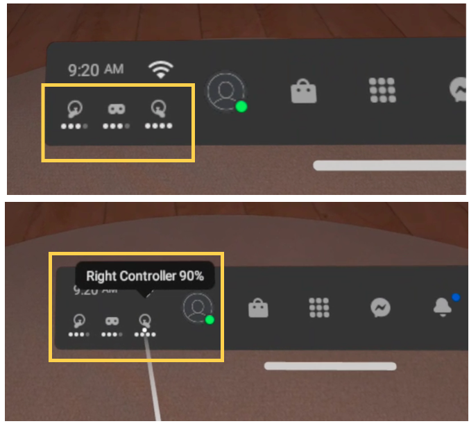
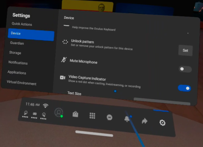
In the main navigation for Oculus Quest, known as the universal menu, battery life for both the headset and controllers displayed in the bottom left. Battery life is presented as four circles (communicating approximate quarters), but users can hover over one of the three icons (left controller, headset, right controller) to see precise battery percentages. This information communicates the current state of the system hardware and may influence player’s behavior.
Similarly, in Bogo, a game where players interact with a virtual pet, a heart icon shows how much brushing still needs to be done in order to progress to the next phase of the adventure. Once the heart is full, the user can move on (or keep brushing if they wish to do so).

2. Match Between System and the Real World
Many people have little to no experience with virtual reality and thus rely on past (physical and digital) experiences to drive their behaviors and expectations in the virtual realm. Building on existing mental models helps users (correctly) predict interactions in a VR system. In fact, since virtual reality often has a close relationship with actual reality, it ought to be easier to apply this heuristic for VR designers than it sometimes might be for traditional 2D-GUI designers.
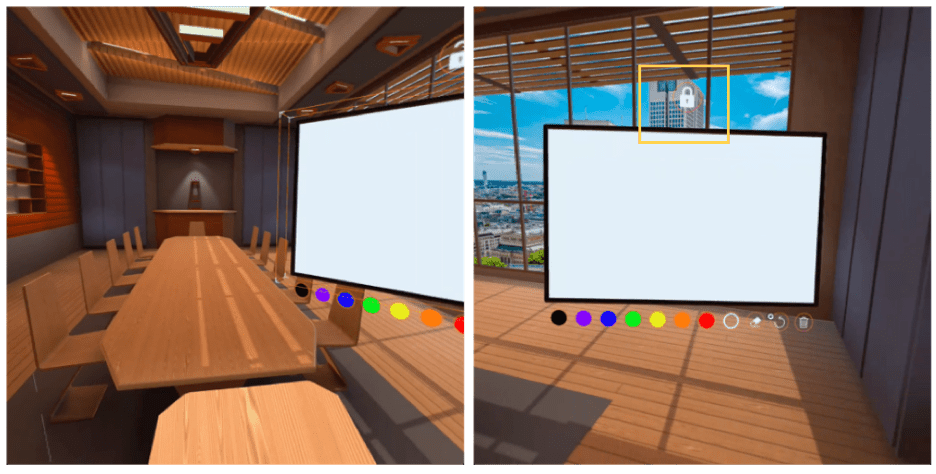
Immersed, a digital work environment, allows users to work with others in familiar settings like coffee shops and conference rooms. In these spaces, users can share screens and brainstorm ideas on a whiteboard (like in the real world). The whiteboard element can be locked or unlocked with a state-switch icon at the top. (While this is not how you interact with a physical whiteboard, at least the padlock icon embodies a strong physical metaphor.)
3. User Control and Freedom
Getting stuck in a virtual environment can be frustrating. Providing a way out, through buttons like Back or Exit, supports users’ sense of freedom and can get them out of an unpleasant experience.
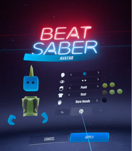
For example, in Beat Saber, a music-based video game, avatars can be customized or randomly generated (via an unlabeled die button). Even when users accidentally click the die button, the Cancel button allows them to abandon the customization screen and keep the previous avatar. Users can also click the Back button next to the die, which reverts the avatar back to the previous version.
In contrast, in the ESPN application, when prompted to sign in with a TV provider like Comcast or Hulu, users are unable to go back to the provider-selection screen. For instance, a user who selects Hulu cannot change their mind and navigate back to the selection screen (unless they exit the application and restart the process). It’s likely that users won’t know their login credentials at the time of this interaction, especially since referencing physical notes or a digital password manager is no easy feat while wearing a headset. A Back button would allow users to revisit the selection screen and browse offerings or even select a different provider (in case they made a mistake). Without a Back button, users may be forced to exit the app. (Unfortunately, Oculus blacks out this type of content during screen recording, so we are not able to provide a screenshot for this interaction.)
4. Consistency and Standards
Jakob’s law of user experience says that users spend most of their time on websites other than yours. Since many of these follow design standards and users are familiar with them, interfaces that go against these standards are prone to increasing user’s cognitive load.
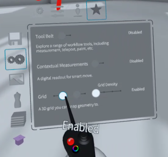
Toggle switches are digital on–off switches that are present throughout the web. They’re also common in virtual environments where users can choose between two mutually exclusive options (like notifications on or off). In Gravity Sketch, a 3D drawing tool, what should be a toggle switch is visualized as a slider, which is confusing and unnecessarily increases the interaction cost. In Settings, to turn the grid on or off, users must click and drag a knob. This interaction requires more effort than a switch and it fails to meet user’s expectations. Despite this poor design, at least Gravity Sketch is internally consistent and uses a similar visual design for all its toggles.
5. Error Prevention
Interface slips and mistakes happen all the time. Aim to design proactive systems that can anticipate and prevent errors.
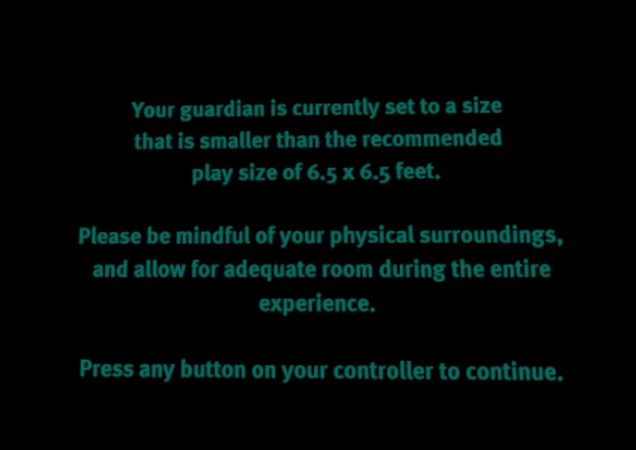
A guardian is a game-play boundary defined by the user. In Oculus, when a player approaches the predefined guardian, a grid appears on screen, to warn them. Many games recommend a minimum guardian size to ensure a reliable and consistent experience. When users play Vader Immortal with a guardian smaller than the recommended gameplay size, they are shown a warning. This information can prevent errors by 1) subtly encouraging users to move to a space where they can have a larger boundary and 2) stressing caution while playing the game to avoid physical harm.
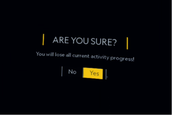
Similarly, in National Geographic Explore VR, before users leave an uncompleted activity, they are prompted with a confirmation message. This message warns users that their current activity progress with be lost if they choose to leave at this point.
6. Recognition Rather than Recall
Minimize the user’s memory load by making elements, actions, and options visible. The user should not have to remember information from one part of the interface to another. Information required to use the design (e.g. field labels or menu items) should be visible or easily retrievable when needed.
Humans’ short-term memory has a limited capacity and virtual experiences are often complex enough (especially for new users). Don’t overburden VR users by asking them to remember additional information.
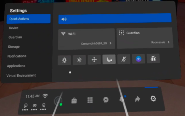
Unlabeled icons with tooltips are a frequent culprit of memory strain in VR interfaces. Throughout Oculus, there were many instances of unlabeled icons. To see what the icons mean, users could hover to reveal a tooltip with the icon description. This design forces users to either memorize the meaning of the icons or put in additional effort to uncover the label.
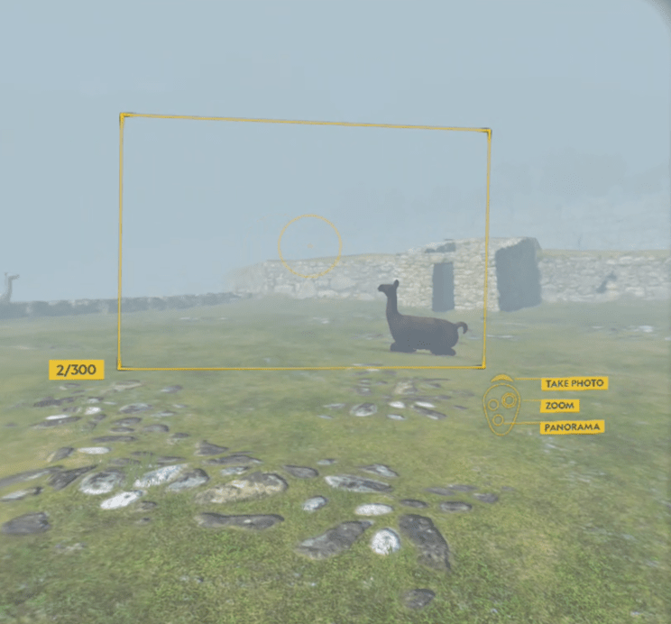
In contrast, National Geographic Explore VR promotes recognition over recall when users engage in activities like taking photos. Instead of asking users to recall which of their controller buttons to use in order to take a photo, the controls (with labels) are shown on screen.
7. Flexibility and Efficiency of Use
Shortcuts — hidden from novice users — may speed up the interaction for the expert user such that the design can cater to both inexperienced and experienced users. Allow users to tailor frequent actions.
Virtual environments, like traditional interfaces, must cater to novice and experienced users. Good defaults are important to keeping everyone happy, but shortcuts and customizations may be needed to keep experienced users engaged.
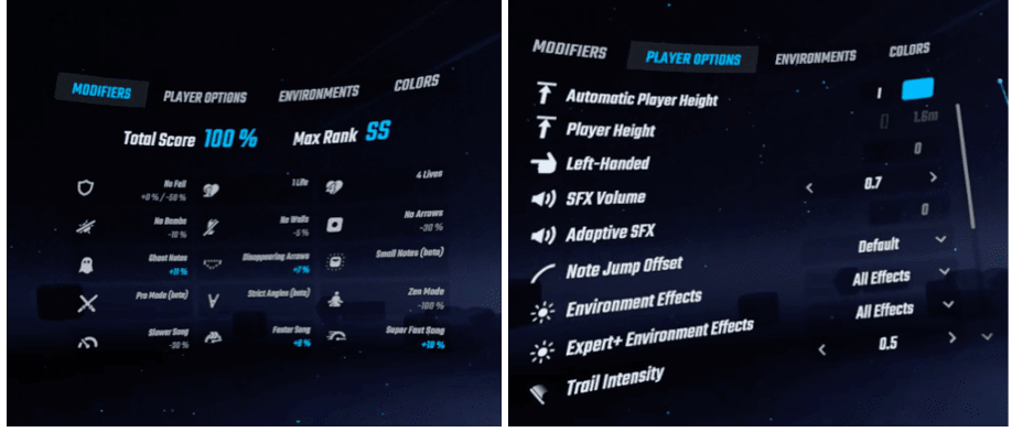
For instance, Beat Saber players can modify their game experience to make it more challenging and enjoyable. This feature makes the gameplay flexible and customizable. Once the modifications are set, they persist for future game sessions, so users don’t need to define them again.
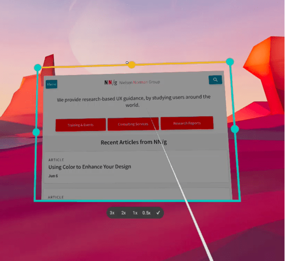
Firefox Reality, a browser designed for virtual reality, allowed users to tailor their browser window size to fit their preferences.
8. Aesthetic and Minimalist design
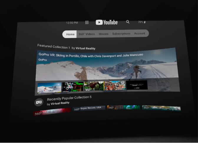
Virtual interfaces can offer a great deal of complexity, which makes it even more important to prioritize the essentials. For example, YouTube did a great job providing elements relevant to user’s primary goals — like viewing VR-friendly videos (360-degree) and search.
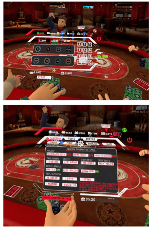
On the other hand, Pokerstars VR is often messy and distracting. During gameplay, when users open the menu to select game-relevant actions (like placing a bet or viewing settings) they are met with a cluttered, difficult-to-scan interface.
9. Help Users Recognize, Diagnose, and Recover from Errors
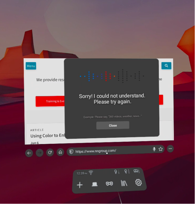
Clear communication and helpful suggestions are key to effective error messages. Unfortunately, Firefox Reality fails to provide constructive error messages when users have trouble using voice commands. Despite several attempts with a variety of queries, the voice capability never understood a word, even though the system provided visual feedback that it captured audio. The system failure was made worse by the unhelpful suggestion to ‘please try again.’ It’s unclear whether it’s a local system issue, a Firefox Reality issue, or something else. This error message helps users recognize a problem but does little to help them diagnose and recover from it.
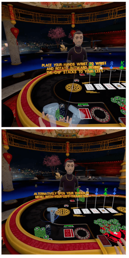
Pokerstars VR offers a training where users could familiarize themselves with some of the primary game interactions, one of which was a complex gesture, likely unfamiliar to most users. If users struggle multiple times with the interaction, they are directed to another (nongestural) method to accomplish the same result. This workflow helps users recognize and recover from the error but doesn’t do much to diagnose the problem or make people understand how the gesture should be performed.
10. Help and Documentation
Virtual-reality experiences often contain a high volume of interactions, some of which are complicated or unfamiliar to users. Instances like these require thoughtful documentation that enables users to solve their problem and get back on track.
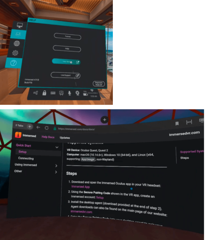
Immersed offers users accessible help and documentation. In fact, users have a variety of channels for support, including video tutorials, frequently asked questions, help documentation, and live support. The documentation pages (available in a web browser) were well organized and easy to scan, applying good information hierarchy and action-oriented phrases.
Conclusion
The user experience of virtual-reality applications can stunt its growth potential. Whether you think VR is overvalued or the future of technology, remember that VR has maintained its allure over a decade of hype. There is consumer interest and engineering capability, but this platform has a lot of room to grow in user experience. Despite being a different type of interface, standard usability heuristics still apply.

